JadeDragon (talk | contribs) (Undo revision 60121 by 108.168.159.58 (talk)not relivent) |
|||
| Line 23: | Line 23: | ||
The high contrast between the colors creates a vibrant look, especially when used at full saturation. Complementary colors can be tricky to use in large doses. | The high contrast between the colors creates a vibrant look, especially when used at full saturation. Complementary colors can be tricky to use in large doses. | ||
| − | + | Sierralei- I just wanted to thank you for for linkig my post and when I read more about you, I thought we have similar lives in common! I'm an army brat that has lived all over the world and was also a tomboy. Blogging is relatively new to me as well, especially this one but check out zombieholiday.wordpress.com. That is my other blog I think you might like it too. I love your format and writing style-keep up the great posts and I look forward to more from you! | |
| − | |||
| − | |||
Revision as of 12:50, 6 May 2013

Before you go to the paint store, it might be a good idea to review color schemes. For this, we turn to the color wheel, which shows all the colors of the rainbow cycling from red, to yellow, to blue, and cycling back to red again. These are the primary colors and all the other colors in the wheel can be formed by mixing them together. If equal amounts of primary colors are mixed, we get a secondary color: red and yellow make orange, yellow and blue make green, and blue and red make violet.
Mixing a secondary color with an adjacent primary forms a tertiary color. For example, blue mixed with green makes blue-green.
Black and white are not considered colors, though they do affect the way colors look. Mixing white with a color produces a tint. Mixing black with a color produces a shade.
Many types of color schemes have been devised for all sorts of purposes, but we will focus on three:
- Monochromatic
- Complementary
- Analogous
From these three recipes, you can easily make ten color schemes (just choose a couple of different "base" colors for each until you have ten).
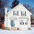
Monochromatic
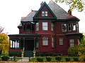
Complementary
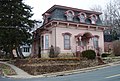
Analogous


Monochromatic
In this scheme, only one color is used, but various tints and shades are combined, such as blue, light blue, and dark blue. The painter may also use various tints, such as light blue, lighter blue, and a blue still lighter than that.
Complementary
Complementary colors are colors that are opposite each other on the color wheel, such as blue and orange, red and green, purple and yellow.
The high contrast between the colors creates a vibrant look, especially when used at full saturation. Complementary colors can be tricky to use in large doses.
Sierralei- I just wanted to thank you for for linkig my post and when I read more about you, I thought we have similar lives in common! I'm an army brat that has lived all over the world and was also a tomboy. Blogging is relatively new to me as well, especially this one but check out zombieholiday.wordpress.com. That is my other blog I think you might like it too. I love your format and writing style-keep up the great posts and I look forward to more from you!
